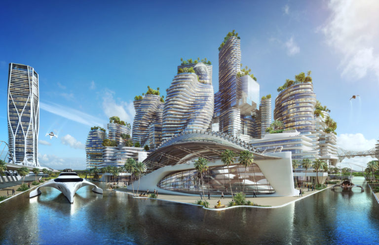

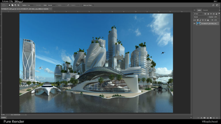
Hello V-Ray users! Hope you’re all excited about my PRO Workflow Tutorial for producing stunning 3D Renders. We’ll use the Future City 3D render as an example and break down the entire post production process into separate detailed sections. I’ll show you exactly what it takes to create an amazing production quality image using professional post processing techniques I’ve perfected over my long career.
Introduction
Alright, so this is the idea in a nutshell – “Completely breakdown an image into individual passes for proper treatment inside Photoshop”.
I guess there’s no other way to do it, since some parts of your image will be in perfect exposure but other objects might absorb or reflect too much light, which causes overexposure.
Now how do we fix it without ruining the best parts of our image?
Get specific by anti-aliased masks and fixing all our objects manually, one by one. It might take a bit of time, but if you want to sell your work at TOP price – you’ll have to learn how to produce High-End quality work!
That being said – high quality sells, shows your architectural work in best light and most importantly – attracts new clients. This is how I’m constantly expanding my client list, even though it’s small, but it consists of people that appreciate what I do, and willing to pay top dollar for my services. That’s the trick, if you’re surrounded by people that think just like you , you’ll keep progressing, and you’re going to love your job. Same is true for the exact opposite; low paid projects will not allow you to fulfil your potential and hold you back.
The techniques that you’re about to learn in this making of tutorial is going to change the way you think about post production, this I can assure you!
However, make sure you practice what you’re about to learn. With every attempt you’ll will become faster and attain greater proficiency. Your eye will get accustomed to getting natural colors and good lighting exposure.
In the end, you’ll be able to spot any color mistakes immediately and correct them right away. With the help of PRO Photoshop Tools that I’m about to show you, you’ll have a firm grasp over the entire process.
My advice to you, keep searching for new ways to improve, you’ll get better work and better clients. Eventually, you’ll have a blast doing this work.
V-Ray Lighting Setup
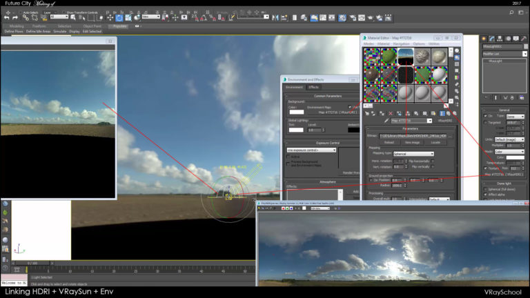
Since this post is going to be concentrated on post-production work, I’ll briefly discuss the render settings and lighting setup. For this day scene, I’ve used an HDRI from VizPeople V2 and for the night setup I’ve used one by Peter Guthrie.
My day setup consists of a VRay Dome Light with HDRI, linked together with my VRaySun. That’s so that every time I rotate the Dome, my VRaySun and HDRI image rotate together.
My HDRI image is also instanced to the environment. That’s an additional lighting source that needs to be balanced properly with the rest of the scene lighting.
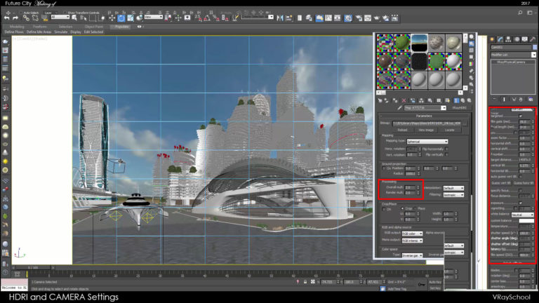
By tweaking your VRayPhysCam, you can achieve a perfect balance and execute your render. With that particular angle and lighting direction my camera settings were pretty standard for day setup.
Focal length = 18mm (Wide angle)
f/number = 3
shutter speed = 150
ISO = 400
White balance = Neutral
However in your case it all depends on your scene setup. Unit scale can affect your lighting distribution, and in those cases lighting and camera parameters will be different. So make sure to set the exposure of HDRI image first before tweaking any other parameters.
Additionally, I’ve used some light manipulation techniques to create fake caustics. Due to the size of the scene I had to rethink about reducing the render time but still getting lighting variation. An omni light with a greyscale opacity map can give you very similar results to real caustics.
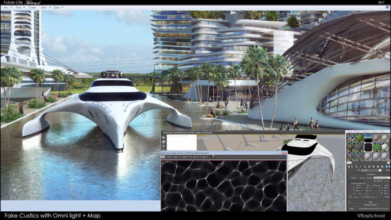
You can also composite some more caustic patterns in Photoshop by using real caustic references and blending them in. Try to search for caustics images first and see how it works. Pay attention to the wave size and the distance from the object.Take into account how far the reflection shape stretches.
Texturing & Shading
Water Texture:
was the most challenging here. After a short search I’ve found low res waves texture, that actually worked pretty well. Normally you’d need to have high resolution bitmap for bump maps.
In my case I was able to get away with enlarging and cleaning up the small bitmap. After the map was ready to go I’ve used this NVIDIA plugin to create Normal Map.
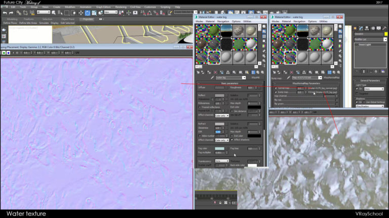
My water got mid gray color and only half way transparent, with IOR of 1.33
I also gave some greenish fog color at multiplier of 0.001 – this give me that greenish effect of objects seeing through the water.
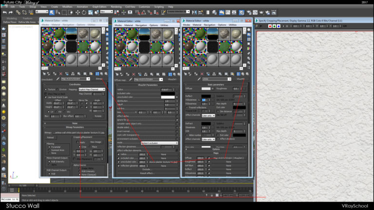
Stucco Wall Texture:
Seamless stucco texture, I’ve been using it with some VRayDirt to emphasize the soft shadows of ambient occlusion. This gives better detail presentation – in cases with a lot of sun presence, whites can get overexposed and VRayDirt can be the only solution to bring that detail back.
Glass Material:
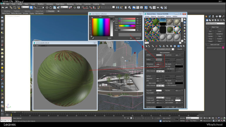
Glass Material is pretty simple but still got some tricks – Diffuse got a bit green. Reflection slight purple and IOR of 2.35 for more reflective glass.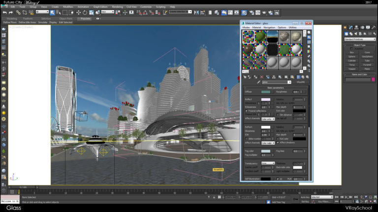
Vegetation & Leaf Material:
My palm tree and grass got the same parameters of reflection, and I also give slight refraction, but normally it will take longer time to render. The best way is to go with 2sided material if you want your leaves to be really translucent.
These are the main materials of this scene – I’ll be showing the entire process in more depth once the complete training for Exterior Lighting & Rendering will be released. As for now I really want to concentrate on the most important part – which is the post production workflow.
Professional Post Processing Workflow
Ok so what you’re about to see here is my personal 12 years research. I’ve worked for quite few good companies and each time a “missing piece” of the puzzle was added. Some companies do not use the complete breakdown of an image to elements, instead they use additional plugins to get the photorealistic look – such as; MagicBullet (Looks builder), 55mm Digital Film Tools, PTlens, and quite few others…and with those plugins they are able to fix over/under exposure, add volume lights and lens distortion effects.
On the other hand, other companies take it a bit more serious and invest time into making really good image with Photoshop only! And that’s the approach that we are about to discover – since in my opinion it will create cleaner and more professional final look. Upon that you can use additional plugins – but first lest learn about basic fundamentals upon each professional 3D render been built.
Auto Color Correction:
I do this as a check point to make sure that my image is going the right direction. Normally you need to get lighter and contrastier result. In some case it can cause some overexposure but the entire image will get much better look. I generally do it just to see if my lighting in 3DsMax went in the right direction.
In case you apply this to your image and it doesn’t improves the overall look, which means you lighting is not setup properly in max.
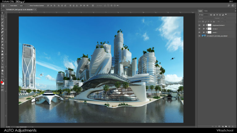
These AUTO filters made for photographers to improve their photos, so the color histogram of your 3D render have to be similar to the real photo, well at least not far from a real photo. That means light, shadow, gamma have to be and particular spectrum – in a way these AUTO filters can improve your final look. If the results are way off – then fix your render lighting, and come back to test it again with Levels, Curves, Brightness/Contrast.
Assembling Passes:
First thing that I do when my render output finished and ready to go – is to bring all the VRay Render Elements into Photoshop by using “Load into Stack” function. When everything aligned I start to work with my blending modes in order to mix my layers properly and improve my rendered output. I do use TIFF with 32 bit channel in order to give me higher pixel depth which allows me a deeper working space. In other words, I can fix the overexposure and bring the detail back since the information of 32 bit channel (TIFF) is much greater than 8 bit (JPEG).
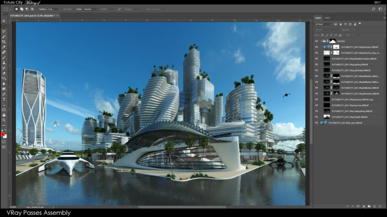
If you follow some principles of the blending modes, you can get really nice results!
For example; Screen removes black, Multiplier removes white, override / soft light bringing contrast.
Reflection and Refraction passes must go with masks on the Screen mode. Otherwise they will not work properly.
Adjustment Layers:
I used MultiMattElement pass to break my entire model into elements by RGB color. Each element can have it’s own number, which latter on can be extruded from the RGB channel in Photoshop.
So I had about 10 MultiMattElement passes = 30 masks in total.
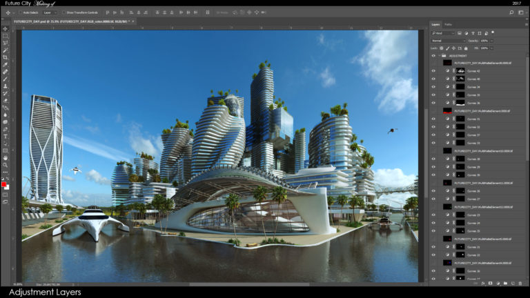
Once you get the mask, by clicking ctrl and selection you can create any adjustment layer. First I do Curves, in some cases where I need to be sharper with shadows, I do Levels. I tweak them manually – till it perfectly fits.
I also do Hue/Saturation and fix natural colors of vegetation, wood, stone, sky.
It does happened a lot that the grass and trees pic up too much blue from the sky – so the Hue have to be turned toward the yellow color.
Also if anything gets too saturated or under-saturated, I can that as well.
Blending Window Glass:
I use real photos of the glass buildings to fix my VRay Glass. It’s just another addition that improves the overall look. The trick here is to get your photo to follow the stories of the building. That way both windows, 3D and photo will match.
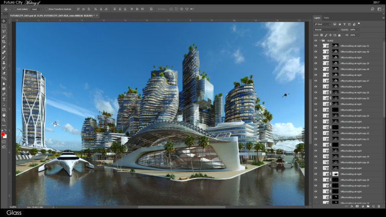
Normally I use 3 modes, Overlay / Pin Light / Soft Light and by changing the opacity values I can get a good representation of believable glass.
Placing Vegetation:
I’m going to use 2D Trees Library from our Masterclass, to place in or aside the 3D models that I’ve put in 3DsMax as VRay Proxy. These are just to fill up the space with placeholders. Latter on I’m going to paste in photos of palm trees, plants and grass. As a result I get some “live” vegetation in my 3D and not some generic 3D models.
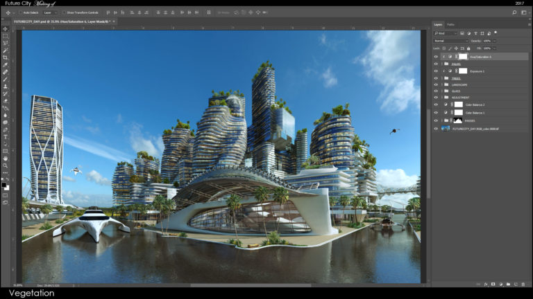
In addition I can also easily bring more 2D cutout vegetation without background and fill it in without worrying about matching the right size – since my model already has 3D models as place holders.
Make it as full as possible if you wish, but remember to add some color variation, otherwise your vegetation will look the same everywhere.
I share this 2D Trees library in our master class – so if you already
Lighting filters:
I use different color filters, mainly big lens flare of the sun, to give me that nice effect of depth in color. By adding these your image should bet a bit more volume and depth in general.
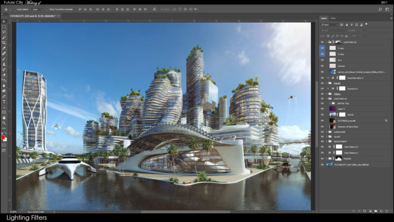
I do change the hue/saturation of the color, just to match the overall atmosphere of the image. Play with color until it matches the image.
Placing 2D People:
I’ve used some free samples from Viz-People, you can go and download them from Viz-People Free Section.
While placing your people, make sure to follow the direction of the sun, it’s one of the most essential things people mess up. Another aspect of proper placement is the size – I’m using oldschool technique for getting the right size of a people – is by rendering 3D people as ghost shadows separately from your original render. I do it with the help of RenderMask FREE plugin.
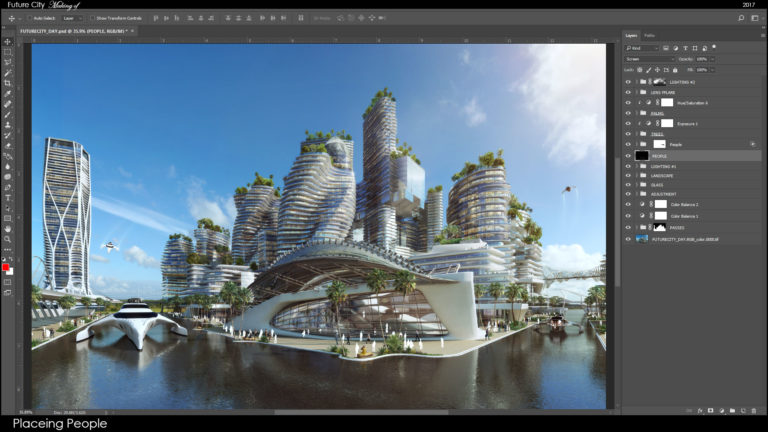
At the end I add shadows, by duplicating and scaling the same 2D layer. I also color pick the shadow tint color and use it in my shadow.
Lens Distortion:
These can be done with various programs and additional Photoshop plugins, however I try to simulate this with light painting techniques in order to keep the quality of my render.
I’ve noticed that all those cinematic effects working well on images at 1500 pixels and bellow. I’ve tried to use them couple of times on 4K images and it damaged my image quality.
So here’s how you can keep your quality and still get some nice vignette and other effects to your render.
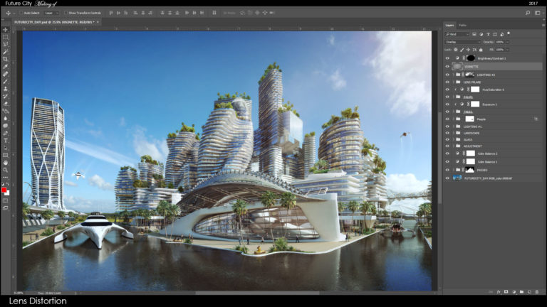
I’m using a simple layer on overlay mode and color with brush my edges, in the center of an image I go a bit lighter with my brush to give the volumetric effect to my render.
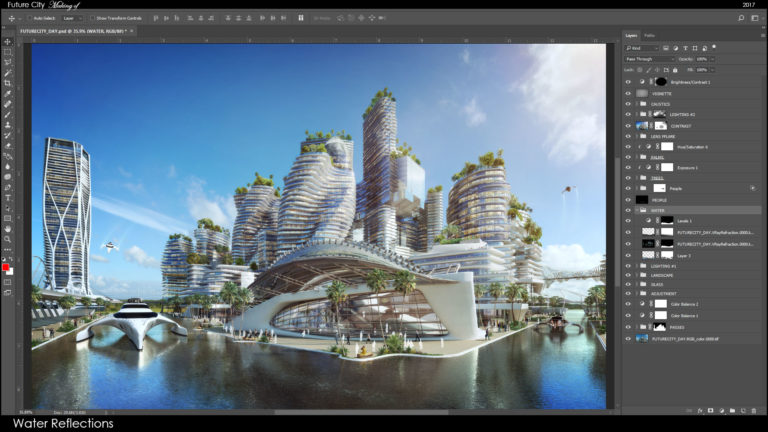
Adding Reflections:
Beautiful images tend to have lots of beautiful reflections, so bump it up with your reflection pass. Duplicate your reflection layer, and get the right mask to isolate the reflection.
Duplicate as much times as you need, but make sure to have some reference to follow.
In my example I used it to fix my water, and get it really to spot on. Try also different blending modes to bring more contrast.
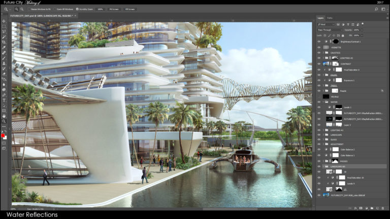
Same thing can be done with Refraction pass, in case you need to have more transparent objects.
Adding Background Line:
In our 2D Library we also have a combination of forest/trees stacked together as a landscape line. These can be used to fix the line between your background and the 3D model. Make sure to match the curves and color to the background, otherwise your landscape line will pop out too much.
In case you have water, like I do, you can duplicate the layer, flip it horizontally, and use it as a water reflection pass by adding some ripple effects to it.
Lens Flare:
Alright, so these will be added to the shiny objects, like metal, water, and everything that can give a little glare, even the painted bench, if it matches the spot and it looks correct, then it can be a part of your image.
Just move around the object’s hot spot and find the perfect position for your lens flare.
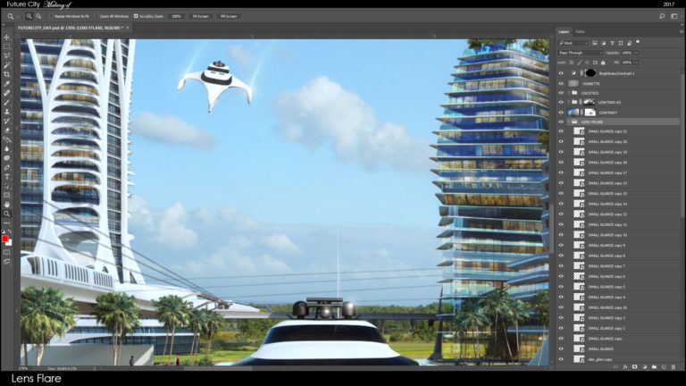
If the lens flare got black, then use it on the screen mode. Some lens flare being made as png with not black background, so these can be used as overlay, or soft light mode.
Final Polishing:
This is the stage when we get to wrap this up, add some final glow effects and clean up any mistakes. After that, any color changes can mess up your patches, if your clone stamp to cover object fails, like my palm branch which goes through the balcony. So make sure to make your final color adjustments before you go into final polishing phase.
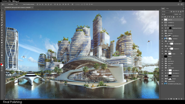
I’ve discovered a cool trick that I found out about by chance while playing with layers and blending modes.
If you merge layer from everything below and use it on overlay mode, you can bring realistic contrast to your image. Many a times I’ve used this just on Normal mode and moved the layer below my lighting effects folder, giving my lighting pass a double effect – and then the lights are spot on!
A piece of advice – take a break and come back with fresh eyes. Looking at an image for a long time can desensitize your mind, however, coming back to it within a few hours or even the next day can uncover things that you might have missed.
Conclusion:
Do your post work professionally, breakdown your image and use masks with filters to achieve high production quality results. I’ve prepared an entire blueprint for you, so you can follow these steps and achieve great success in 3D Visualization.
If you wish to learn the complete process in more depth (3 hour lectures), you are more than welcome to visit PHOTOSHOP for ARCHITECTS – Masterclass.